Showing posts with label natural light. Show all posts

Wednesday, November 26, 2014

Mid-Century Modern Remodel - Red River Remodelers' new office Part 3!

Ok, I'm in trouble... I didn't post this last Friday! But, I promise it was worth the wait! I know I've roped you into this office remodel, and if you get excited as easily as I do, then you'll love what's coming! Remember this picture from the last blog?
Well... here's what we did with those nice pink cinderblock walls and aluminum windows...
Yeah, holy guacamole! That's exactly what I said when I saw the old pictures! Replacing the window with a more sleek, clean line picture window, Red River Remodelers really ties the kitchenette in with the conference room and the oversized window showcased in there.  The cabinets are Oak Silas from W.W. Wood Products, and they frame the space out perfectly. Sean & Angie made a conscious effort not to extend the cabinets to the ceiling, as to not take away from those amazing beams! 

I tell you one thing, I am in LOVE with the tile... It's Nemo Atom in Eggshell. Here's the kicker: they're different styles! You can order it "In", "Out", or "Flat." We mixed it up! I love the randomness and the texture it brings to the small space.
Now, I know I get a little excited... and I try to tone it down, but Angie killed it with these lights!! The Urban Renewal Antique Brass Sconce by Feiss is super versatile; follow the link to Lamps Plus and see the picture they have on there. You can turn them! They can be vertical or horizontal! Love the vintage amazingness they bring to the office.

This next little bit you've seen before... it's what I tempted you with weeks ago! Our bathroom! Sarah may have moved to Austin, but she will always live on in this bathroom with this freaking bada** wall she designed!
Oh, I almost forgot! Would you like to see what it used to look like?
I think that might be enough to hold you over for Thanksgiving :) Monday, I will get you Sean and Angie's offices!! AHH! Guess who's office this used to be...


Friday, June 27, 2014

Subway Tile Party!

Yes, you read that title correctly! We are throwing a subway tile party during today's blog and you are all invited. Subway tile may seem plain just sitting in a box on shelf in Lowe's, but we know better. We are going to share with you several Red River Remodelers projects in which we used the Subway in a variety of ways. 

First off, we have a kitchen back splash in the South Highlands area of Shreveport where we mixed in a little glass to zazz it up. I think it worked out pretty well! Look at how adorable and spunky this space is!  Great way to introduce color but not be overwhelmed by it.


In this project Red River Remodelers used a glass accent tile band that really helps to create movement and energy across the kitchen. This can also work well to make a smaller kitchen seem larger. It's all... an illusion!


In this kitchen, and coincidentally the one above, we put in a travertine subway tile that has more texture to it than your typical porcelain or ceramic subway tile. We are definitely still in love with this galley style layout!


I know some of you have seen this bad boy on the Parade of Homes a couple weeks ago! Here we brought things to the next level used a beveled edge subway. 


In this little kitchen we have your typical white porcelain subway, but we used a darker grout to really make things pop! Dark grout and dark cabinets? Yes ma'am!


Same white subway tile just with white grout! White cabinets, dark counter tops, sleek and clean white subway back splash. I could throw a party in this kitchen!


Don't forget to check out our Houzz! Add our projects to your idea books! You don't have a Houzz.com account?! What're you waiting for?! It's always a design party over there! 

-sarah reuther


Friday, July 12, 2013

Maximizing Square Footage


Tips on how to make a small area visually more open and spacious


{Color}

Light colors in the same family on floors, walls, and ceilings will trick the eye into thinking the room is bigger. If there is a crazy color on every surface or dark colors the room will seem too busy and claustrophobic Your eyes automatically look from floor to ceiling so a continuous line of light similar colors will read as "Ahh I can breath in this space" rather than "I feel like the walls are closing in."  


{Mirrors}

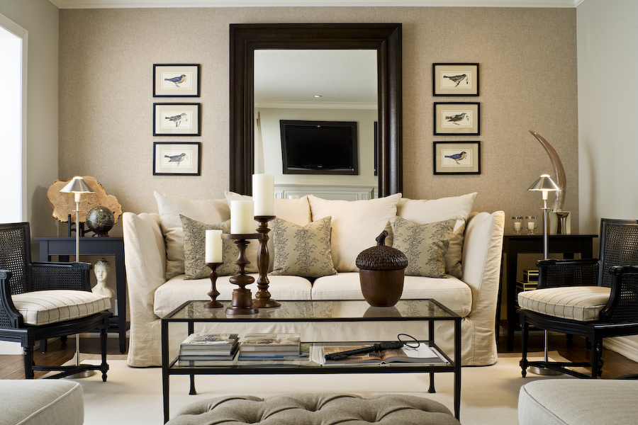
Reflect your room! Mirrors will make a small space seem like it goes on and on. A good trick in a narrow room is a big mirror on the long wall or standing mirror on the floor. It will reflect light coming from within the room and natural light from outside. 


{Balance}

 A small space can feel too cluttered with big furniture; but it can also feel awkward with furniture that doesn't take up enough floor space. The area needs to be proportional so it will feel bigger. For a living space example, if you have a large sofa balance it out with a few smaller items. A plump sofa on one side and two armchairs with a small table on the other is a nice balance in a narrow room. 


Another nice technique in a small square shaped room is to "float" the furniture. Bring it off of the walls and allow a range of space around each furniture piece; it helps a lot in lightening up the area and making it seem less dense or heavy on the eyes. Traffic is important when deciding placement for your space. Avoid putting too much on the floor.Think about where people will be walking and leave as much room as possible so it won't feel crowded.


One more idea for decor and/or furniture is height variance. A room where all the furnishings or decor are the same height will lack interest. Using the 3:1 rule will balance your space and make it aesthetically pleasing. For example, three vases of varying heights grouped together and balanced by a single larger object on the opposite side of the mantel, shelf, or coffee table makes a striking design. 


{Contrasting and Blending}

Homes look professionally designed when new elements are mixed with old, smooth contrasts with rough, polished is balanced with nubby. Don’t go for perfection but strive for ambiance. A small room will seem more charismatic when you mix up patterns, colors, and textures in a refined way. For example, balance a bold color with a large pattern that blends but doesn't match exactly, or balance a bright warm color with a textured cool color. Or choose colors that are the same hue but vary in intensity and scatter them evenly around your room. 


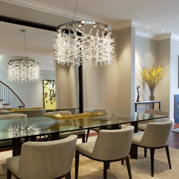
Dining area // "5 Tips for Designing Small Spaces"


{Lighting}

A good tip is staying away from floor lamps and relying on table lamps and ceiling lighting. Giving a smaller area character could be done with a lighting piece. It balances the room on its center and will draw the eyes to it. A chandelier could easily be a statement/conversation piece. It is fun to make lighting unique to your personality and taste.