Tips on how to make a small area visually more open and spacious
{Color}
Light colors in the same family on floors, walls, and ceilings will trick the eye into thinking the room is bigger. If there is a crazy color on every surface or dark colors the room will seem too busy and claustrophobic Your eyes automatically look from floor to ceiling so a continuous line of light similar colors will read as "Ahh I can breath in this space" rather than "I feel like the walls are closing in."


{Mirrors}
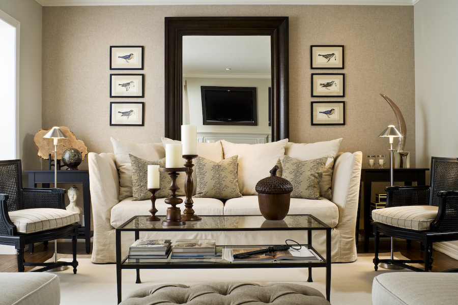
Reflect your room! Mirrors will make a small space seem like it goes on and on. A good trick in a narrow room is a big mirror on the long wall or standing mirror on the floor. It will reflect light coming from within the room and natural light from outside.


{Balance}
A small space can feel too cluttered with big furniture; but it can also feel awkward with furniture that doesn't take up enough floor space. The area needs to be proportional so it will feel bigger. For a living space example, if you have a large sofa balance it out with a few smaller items. A plump sofa on one side and two armchairs with a small table on the other is a nice balance in a narrow room.
Another nice technique in a small square shaped room is to "float" the furniture. Bring it off of the walls and allow a range of space around each furniture piece; it helps a lot in lightening up the area and making it seem less dense or heavy on the eyes. Traffic is important when deciding placement for your space. Avoid putting too much on the floor.Think about where people will be walking and leave as much room as possible so it won't feel crowded.
One more idea for decor and/or furniture is height variance. A room where all the furnishings or decor are the same height will lack interest. Using the 3:1 rule will balance your space and make it aesthetically pleasing. For example, three vases of varying heights grouped together and balanced by a single larger object on the opposite side of the mantel, shelf, or coffee table makes a striking design.


{Contrasting and Blending}
Homes look professionally designed when new elements are mixed with old, smooth contrasts with rough, polished is balanced with nubby. Don’t go for perfection but strive for ambiance. A small room will seem more charismatic when you mix up patterns, colors, and textures in a refined way. For example, balance a bold color with a large pattern that blends but doesn't match exactly, or balance a bright warm color with a textured cool color. Or choose colors that are the same hue but vary in intensity and scatter them evenly around your room.


{Lighting}
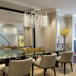
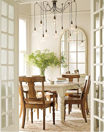
A good tip is staying away from floor lamps and relying on table lamps and ceiling lighting. Giving a smaller area character could be done with a lighting piece. It balances the room on its center and will draw the eyes to it. A chandelier could easily be a statement/conversation piece. It is fun to make lighting unique to your personality and taste.


No comments:
Post a Comment